Graphic style
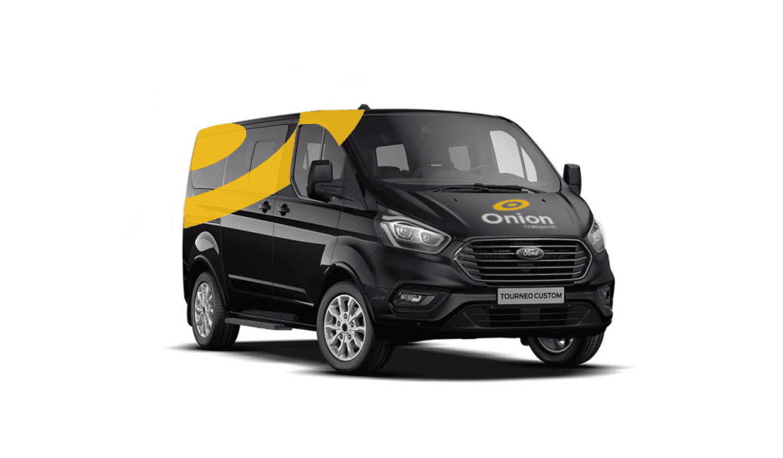
The graphic style is based on colours linked to the world of logistics and transport combined with a modern and professional symbolism that best represents the identity of the company.
Brand identity
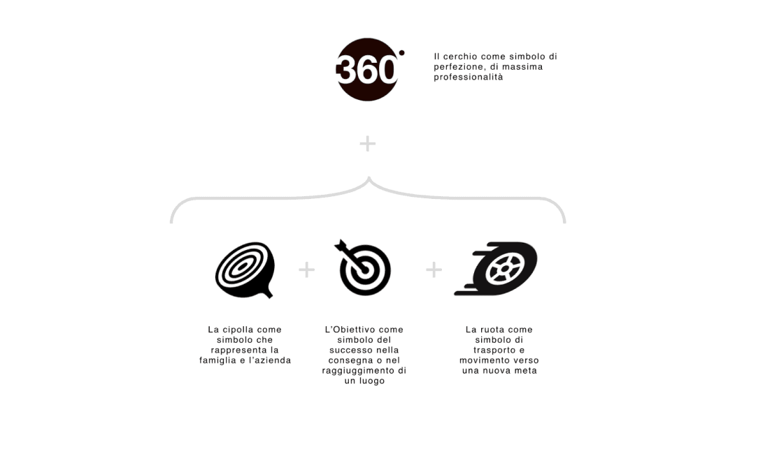
For the logo, a simple and essential shape such as a circle was chosen to symbolise the ambition of perfection at work.
The circle was combined with the shape of the onion, which represents the company's name, together with the symbol of the goal in the sense of a goal achieved, work efficiency and the attainment of a result/place.
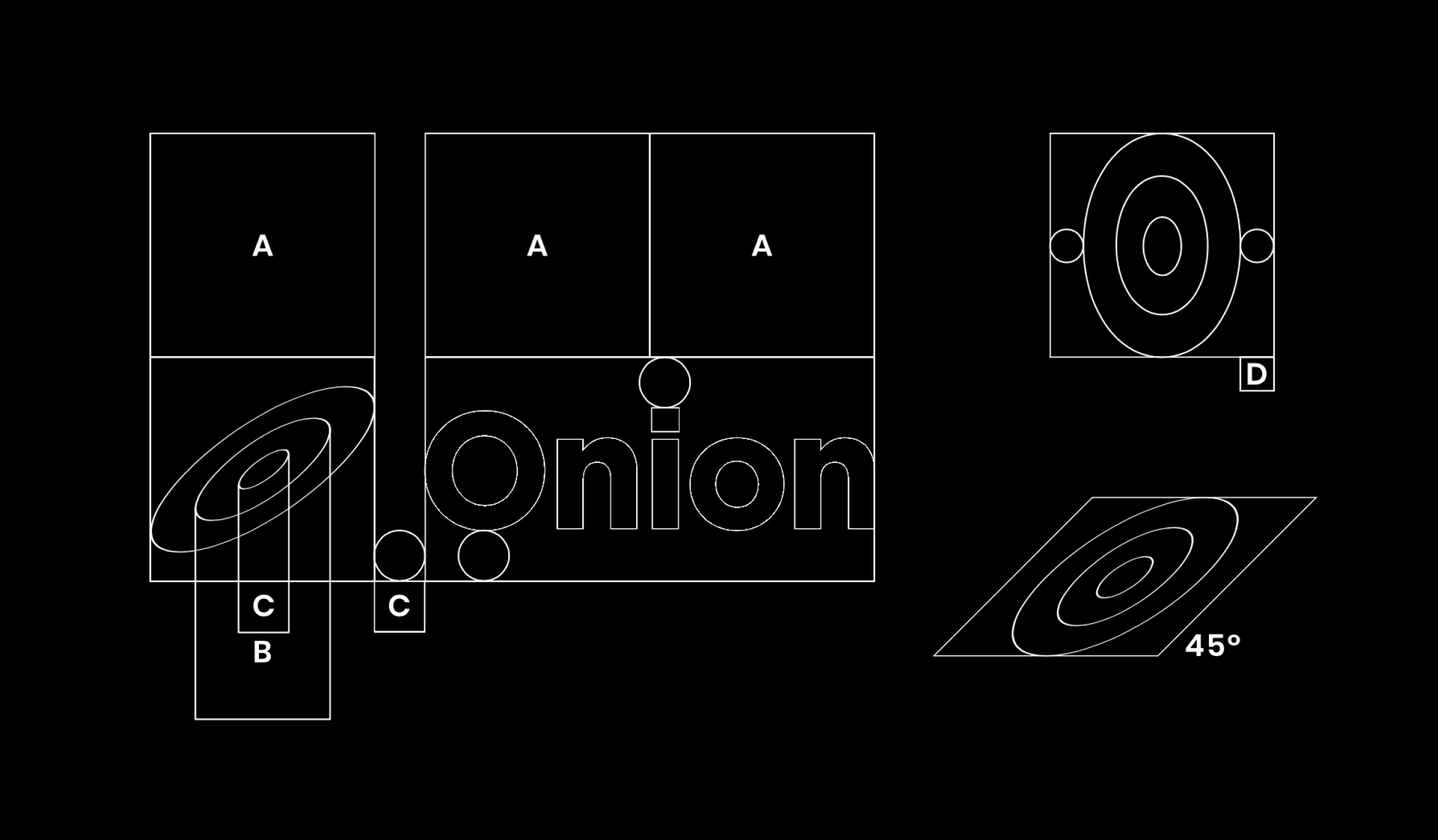
The circle was given a slant to make the logo dynamic and reminiscent of a moving wheel. The logo is intended to represent a professional and customer-oriented company, offering an efficient transport and logistics service.
Tools


2023, Italy
